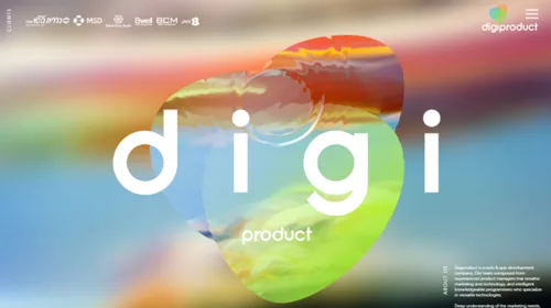
In last post I explained, why web-design is not WHAT is made, but HOW it’s made.
…As a web-designer AND web-developer, I really understand the struggle.
Let’s try to understand why we have the trends that we have for now.
Why Flat?
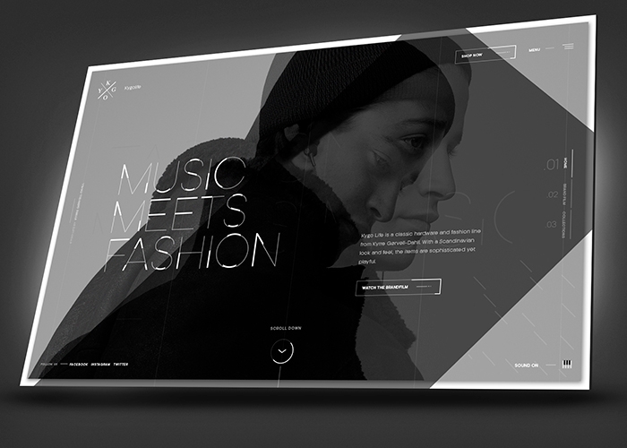
Because web is speedily proceeding to mobile-first. And thus we had to reduce the weight of our web-applications. All those glossy, shadowy, volumetric things on web just ate too much traffic without no real use. We also spent too much time on drawing and implementing icons, arrows and other little elements, while we had to spend much more time on app-development itself. So digital (font) icons came to the scene and saved us a ton of efforts. Bless you, Font-Awesome!
HTML5 and CSS3 uprise did also make an impact.
You don’t even imagine how hard it was to make round-cornered blocks! We drew them, we cut them and then we made 9-sliced tables per block to put those rounded corners… That was a nightmare of every web-developer.
HTML and CSS are open-sourced. That means that any developer can contribute. So while HTML5 was developed, programmers from all over the world were offering different features. And now we have those god damn round corners.
And then some curious developers (as I imagine it) just tried to give really huge values for corner rounding. Ta-dam! We’ve got web CIRCLES.
That’s the moment when everyone just lost their minds. Circles everywhere. Avatars, photos, buttons, ‘teams’, ‘services’… Everywhere. Now that’s how you get a trend.
And, of course, CSS3 animations.
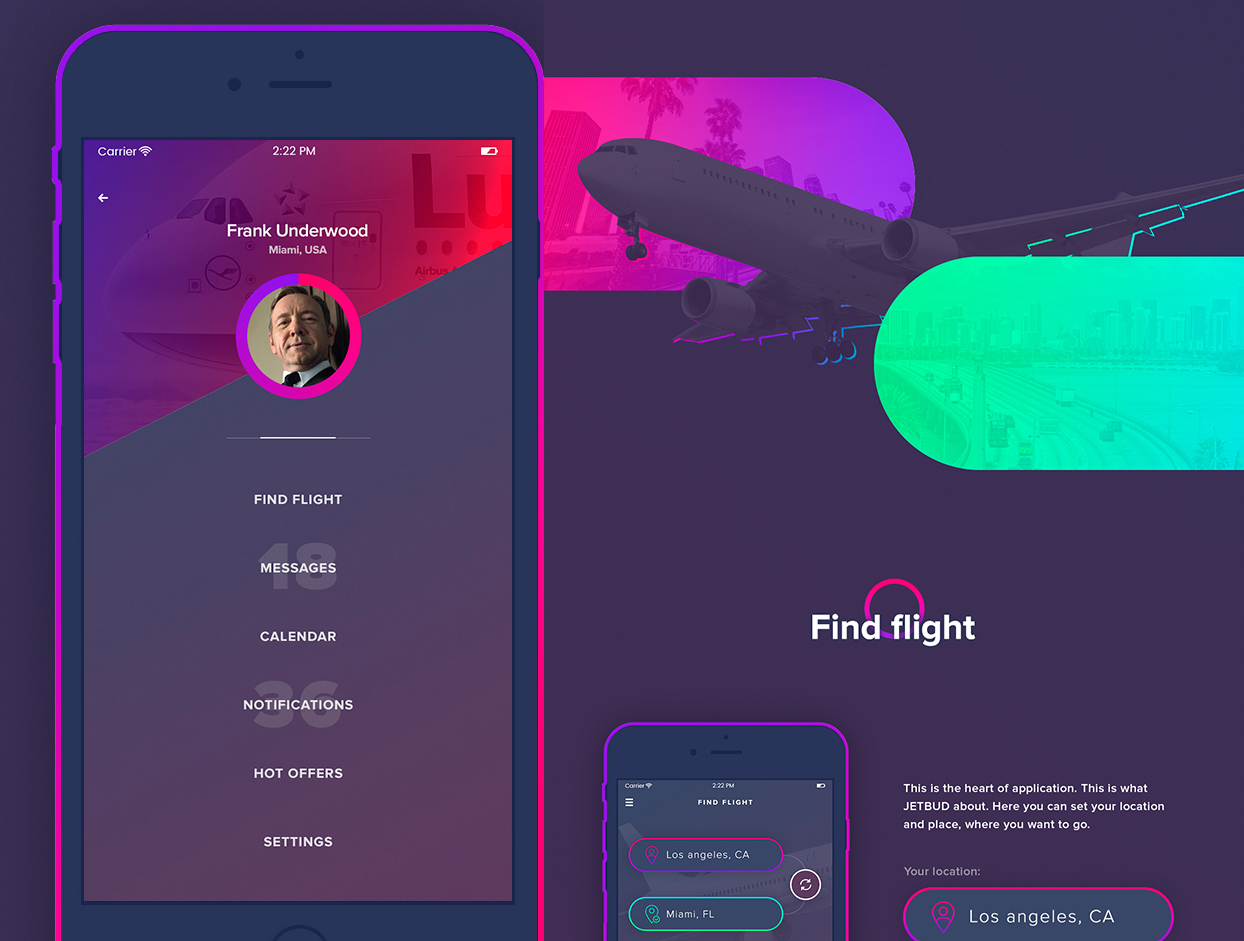
CSS3 and HTML5 made it really simple to animate html-written elements. That is why we couldn’t and didn’t want to use shadowy and glossy things anymore! All these gradients and reflections were simple with Flash, but Flash was abandoned (thanks to Steve Jobs). So we urgently needed some new inspirational ways. We found them in RETRO – flat design, flat patterns, pastel colors, newspaper ads and signboards design of 70’s.
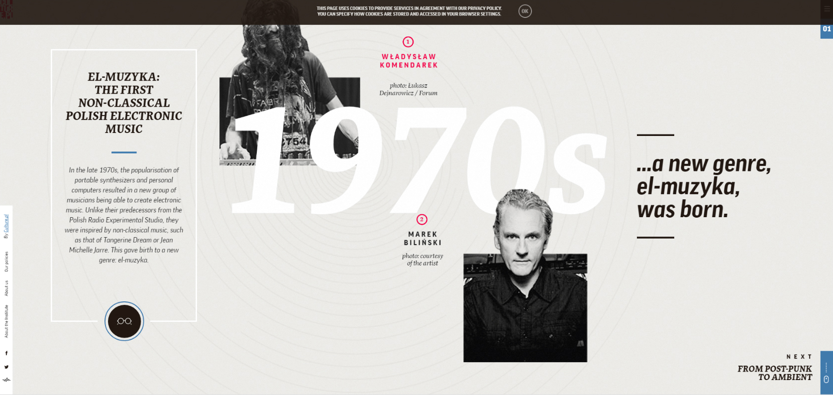
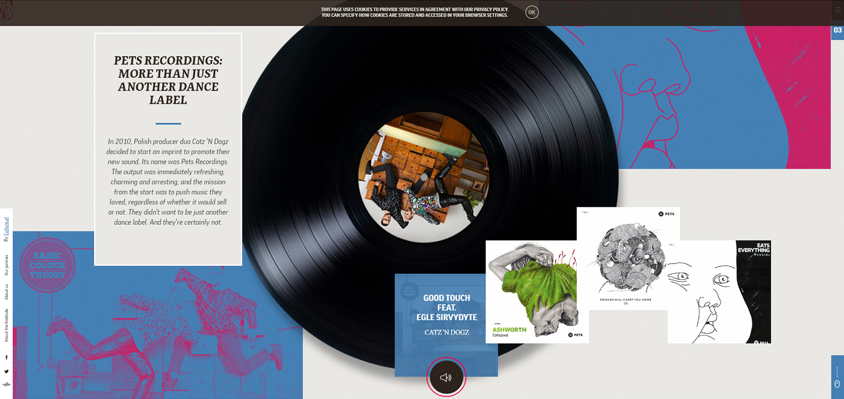
Now we are running out of ideas, so new Big Trend is coming.
Why background-videos and Parallax-effect?
Though we went to flat design, our mind still tends to viewing space, ‘air’. We want to dive into web, the same as we want to dive into paintings or art photos.
Videos add this kind of life and motion.
